A Moody Living Room Update
Our living is a space that has had many looks throughout the years since moving in. I've tried several wall colors, furniture combinations, and shelving ideas but it's never really felt quite right. The walls in this room are 12 feet tall which is a feature that drew us to this house, but it has also proven to be one of the hardest to design around.
It has taken well over five years, but I think we’ve finally landed on a design that makes the space feel welcoming and comfortable for our family.
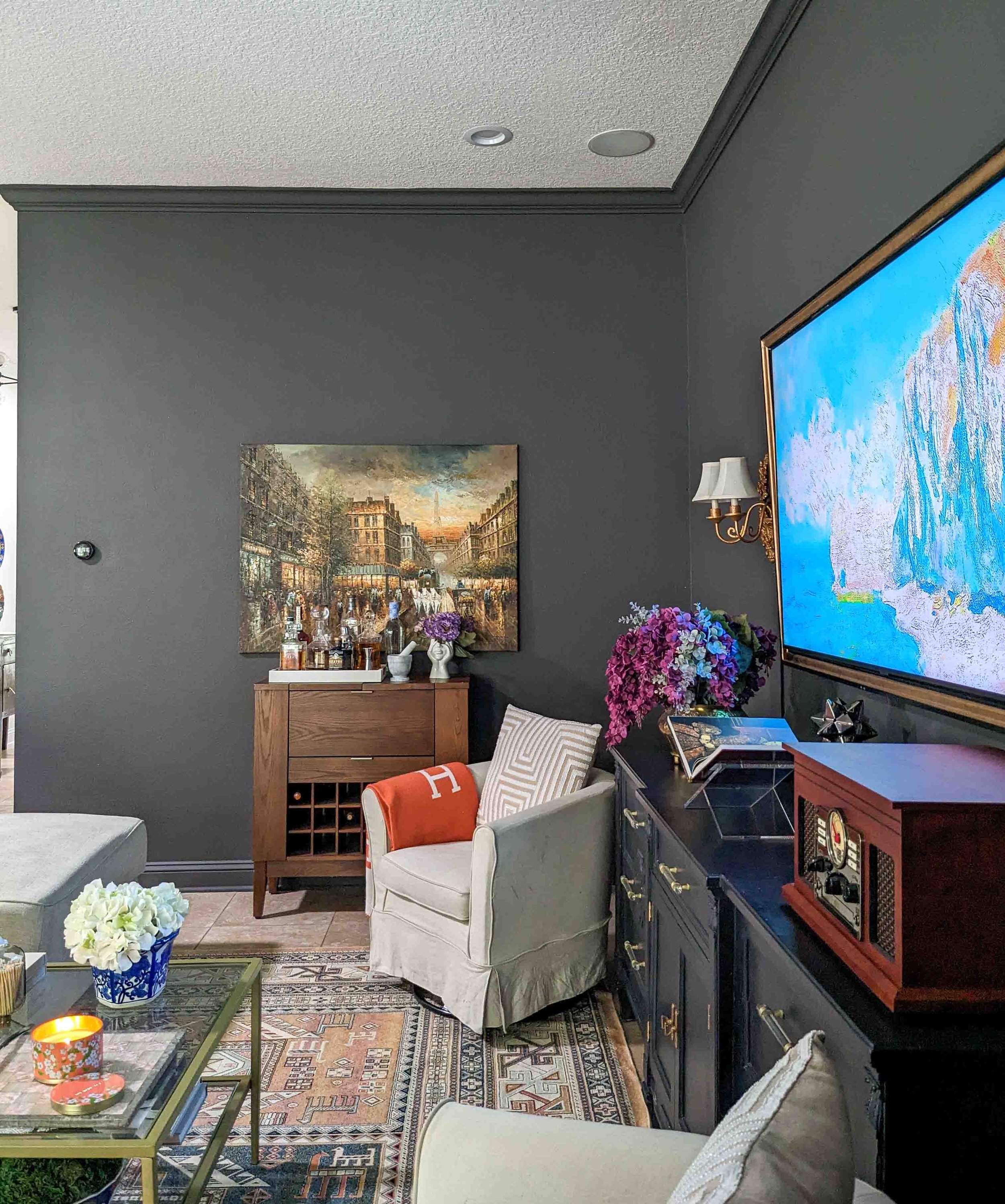
Once I painted the walls Urbane Bronze by Sherwin Williams, the room finally felt like it's own space rather than one big room with the kitchen and dinning room.
Aside from the height of the room, my next biggest challenge was the television. I've always disliked having the TV be such a big focal point in the room. I've contemplated moving the TV to the opposite wall so you can't see it when you first walk in to the space. But my husband always reminds me how we have built in speakers and all of the connections on the TV wall.
I finally decided to embrace the TV and do my best to work with it. So I flanked the TV with two antique wall sconces that my mom handed down to me and DIY'd a TV frame. Below the TV, I sourced a long dresser that I got off Facebook Marketplace and painted it black and update the pulls for a more modern look.
Blog Posts you may enjoy:
Modern Traditional Living Room
How to Build a TV Picture Frame - The Easy Way! — House by the Preserve
The long sectional helps define the space but I decided to remove the right side of the sectional to provide us with ample walking room. I added to side chairs to flank each side of the TV console. On the right side of the room, we brought in a desk where our kids can quickly do homework or I can sit down and get some work done while the kids play in their playroom.
I love that the desk is in view as your first walk in the space. So I added two paintings from my grandmother to highlight this spot.
On the opposite side, I brought in this old Crate and Barrel bar that we love for cocktail hour. After we get the kids go to bed, my husband and I love to wind down with our favorite drink as we chat about our days.
Most recently, I found this coffee table on Facebook Marketplace and I love how it completed the space. I had been on the hunt for a while but just couldn't find the right piece. I love that this one is glass so that we can see through it making it feel less heavy. I love how large it is because it fills the room nicely without impacting the walking space.
I'm glad this space has taken so much time to get right because I just love the result. As you can see, none of this happened over night. It's been slowly tweaking here and there and living with the space to really take in how our family uses the room.
*This post contains affiliate links, please read my full disclosure here. Thank you for supporting my blog.*
SHOP THIS POST:
Maria Lorena
I’m a mom of two and wife to a seriously supportive hubby, living our best life in our forever house by the preserve! I'm all about helping you create a stylish, Pinterest-worthy home on a budget. Let's obsess over interior design, home decor, DIY, and home improvement projects to help you create your best home. Follow along and say hello! I love hearing from you.
Currently Trending
Join me on Instagram!
Looking for something?


